See which need each project answered, what we made, and the thinking behind our decisions.
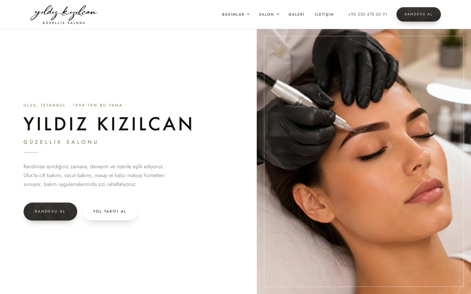
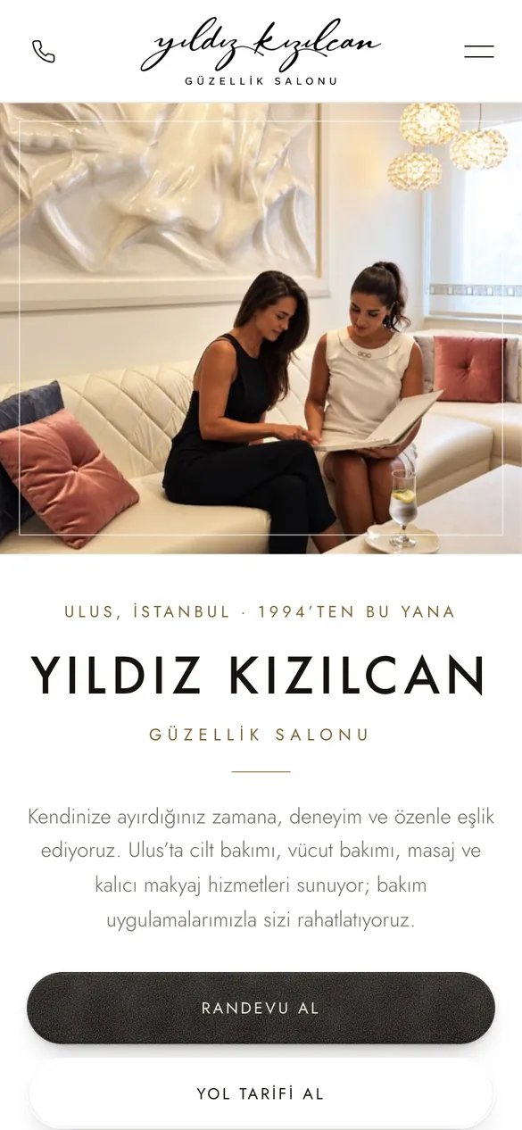
Beauty salon · Ulus, Istanbul · since 1994
How do you make years of trust visible online?
The need
A salon working in Ulus since 1994 had earned its clients' trust in person. The brief: carry that same calm confidence to someone meeting it online for the first time.
Our role
Refining the brand's voice, designing and building the website, local search setup, an in-salon digital catalogue and short-form video editing.
Design decisions
White and champagne tones with quiet typography — luxury shown through space and proportion, not adjectives.
One step to book: every appointment button opens the salon's WhatsApp line directly.
The treatment list on the site matches the in-salon catalogue exactly — what people see online is what they find in the salon.
Deliverables
Website, mobile-first · Local search (SEO) setup · In-salon digital catalogue · Short-form videos
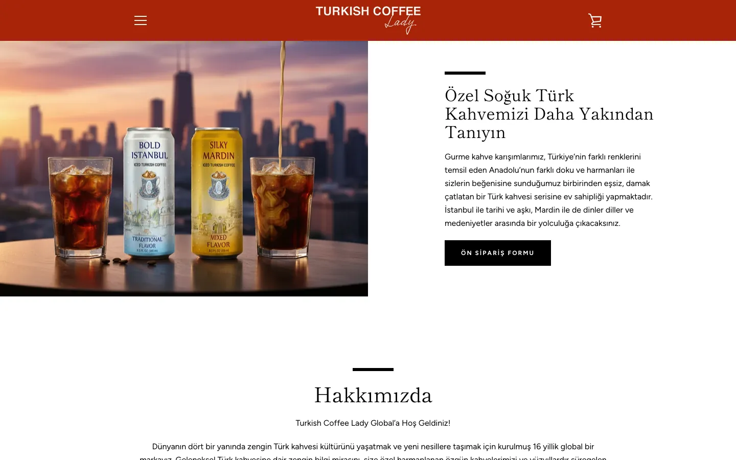
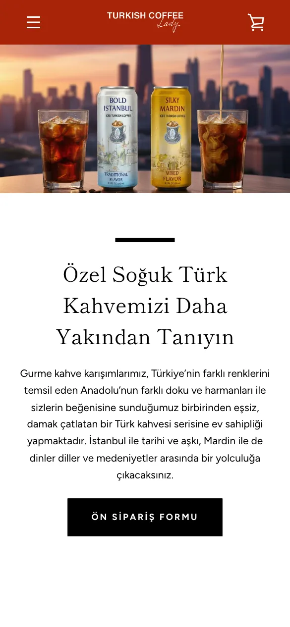
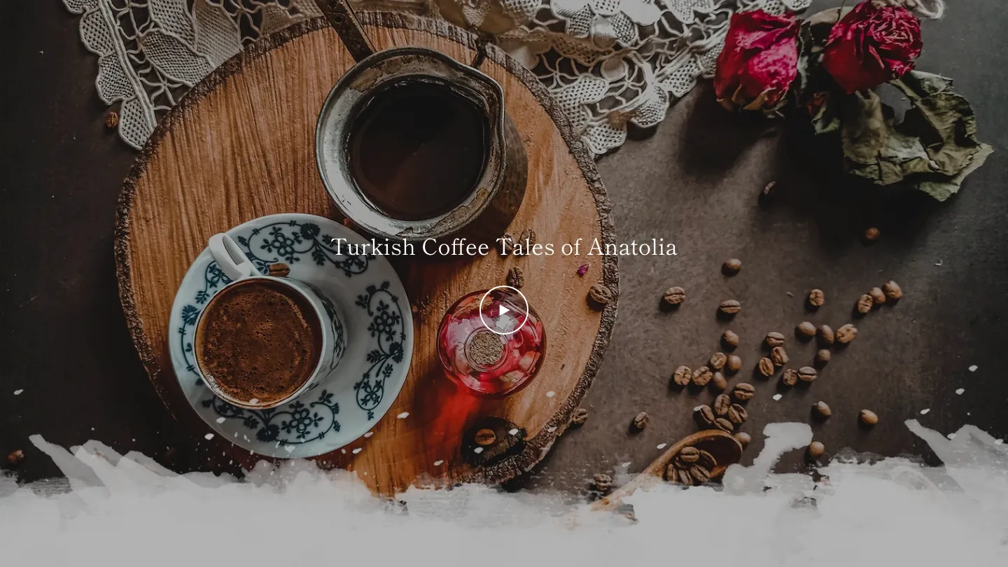
Turkish coffee brand · Türkiye · iced coffee and franchising
How do you open a centuries-old coffee ritual to new customers — and new partners?
The need
A Turkish coffee brand that traces its ritual back 500 years, now bringing out an iced Turkish coffee in cans and inviting new franchise partners. The brief: a site for Türkiye that tells the culture behind the coffee, collects pre-orders for the iced coffee and gives future partners a clear way in.
Our role
Designing and building the brand's website for Türkiye: the homepage and its film sections, the pre-order route for the iced coffee, the franchise handbook and application pages, and the store's sales and delivery pages.
Design decisions
The first screen belongs to the new product: the two cans of iced coffee, a few lines on the Anatolian blends behind them and one action — the pre-order form.
Future partners get their own route: the franchise handbook and the application sit at the top of the menu, and the About section on the homepage spells out what a partner can offer under one brand.
The culture is told on film: the homepage introduces the brand's documentary — Turkish coffee's story told in eight cities — and plays two full-width films right below it.
Deliverables
Website design and development · Iced coffee pre-order route · Franchise handbook and application pages · Sales and delivery pages for Türkiye
How do you make a big financial decision feel clear from the first screen?
The need
A mortgage company founded in 2023, working with home buyers and investors in several US states. The brief: a site where each visitor — a buyer, a domestic investor or an international one — quickly finds their route and a clear next step.
Our role
Designing and building the website: its structure, page design, the loan programme pages and the routes to pre-approval and application.
Design decisions
Two clear actions from the first screen: get pre-approved, or apply for a mortgage.
Qualified and non-qualified mortgages as separate paths, with their own routes for domestic and foreign investors.
Proof next to the promise: key figures run under the menu, and recent closings are shown with amount, city and date.
Deliverables
Website design and development · Loan programme pages · Pre-approval and application routes · Knowledge base and blog
How do you carry a clothing brand's mood all the way to checkout?
The need
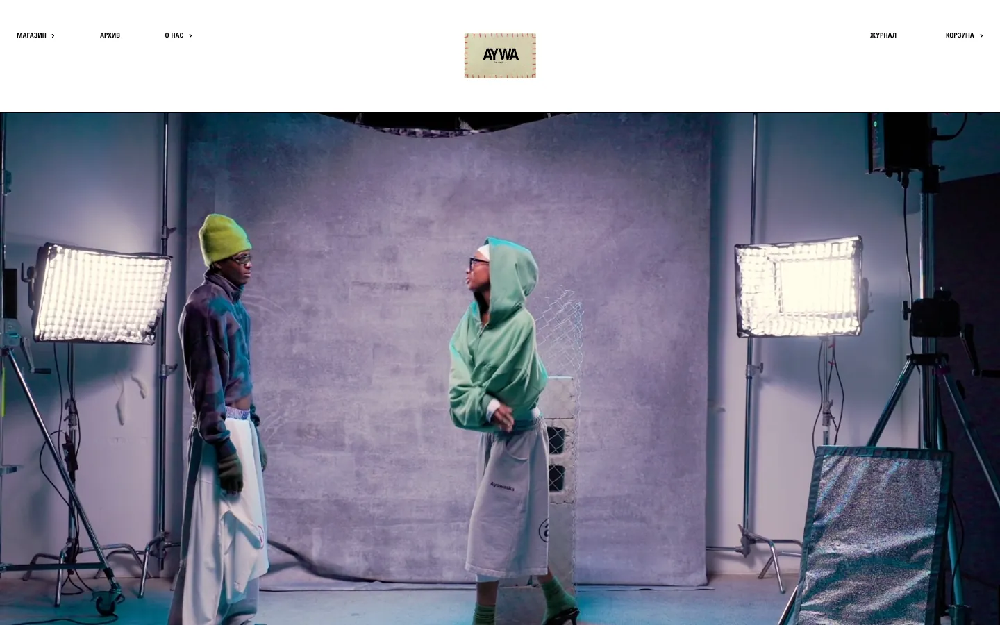
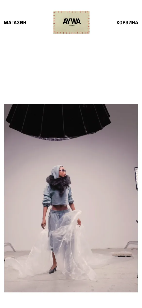
A Moscow clothing brand that releases its pieces in limited, non-repeating drops alongside a permanent collection. The brief: an online store that feels like the brand — film and imagery first — while keeping the path from a collection to a paid order short on a phone.
Our role
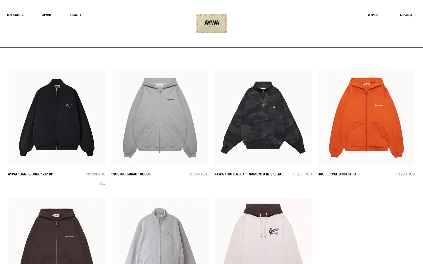
Creative direction and design of the online store, built together with a development partner: the film-led homepage, the collection and category pages, the product pages and the mobile shopping flow through cart and checkout.
Design decisions
The first screen is the campaign film under a quiet header — Shop, Archive, About, Journal, Cart — so the clothes set the tone before any text does.
The shop follows the way the brand releases clothes — a collaboration, the permanent collection and limited drops — with category pages beside them and an archive where past pieces stay visible.
Product pages answer the fit question on the spot — the model's height and the size they wear, a care guide — with payment in instalments shown next to the price.
Deliverables
Creative direction and store design · Store build, with a development partner · Collection, category and product pages · Mobile-first cart and checkout
We only publish work the client has approved, and we don't publish figures we haven't measured. Where a client prefers privacy, we list their name on the client page and talk about the work only in a conversation, with their consent.
Frequently asked questions
Can I see more examples?
Yes, in a conversation — we show work relevant to your need wherever the client has agreed to it.
Why don't you publish results figures?
We publish figures only when they were measured and the client approves them. Where that isn't the case, we show the decisions and what was delivered.
bemacci.com
See the whole picture
The homepage brings it together: selected work, where to start, how we work and who is behind BEMACCI.